How To Convert Pantone To CMYK
When it comes to printing, some designers have had color issues. Getting colors to come out right on printed media seems tricky, but it has a simple solution. Learning how to convert Pantone to CMYK is the best solution for this modern problem.

How To Convert Pantone to CMYK 101
You may not even know what CMYK or Pantone means unless you’re a graphic designer using Photoshop or Illustrator every day. But if you’re in business or even a homeowner who wants a panoramic print of their wedding party, you want the colors in your photographs to look realistic.
CMYK Is A Color Printing Process That Consists Of Four Colors
C- Cyan
M- Magenta
Y- Yellow
K- Black
If you have an inkjet printer, you’ve probably seen these letters when you’ve replaced your ink. CMYK is the most cost-effective and most popular color system on the market today. These four base colors can make just about any color that is high quality.
Tiny dots of colors are printed at different angles to get the best quality print. Your printer at home probably won’t give you the quality of printing that we have at Printmoz. Our EFI Vutek LX3 Pro printers are the best in the industry and can take your project to the next level. Take a look are our process below.
See Full Printmoz Product Line
The Pantone Color Matching System Is Also Known as PMS
Pantone (or PMS) is a color system that manufacturers use to keep their color palettes consistent. According to Wikipedia, and there’s a set of Pantone colors that can be printed and reproduced using CMYK.
Many of the Pantone palettes or PMS to CMYK won’t come out looking like you expect unless they’re converted the right way.
Digital works use RGB. Websites, televisions and computers and digital cameras use RGB. RGB consists of three primary colors. R- red, G- green, and B- blue. I wanted you to make sure you knew the difference. To convert a file from PMS to RGB you can use an online converter tool.
Convert PMS to CMYK - The Easy Way
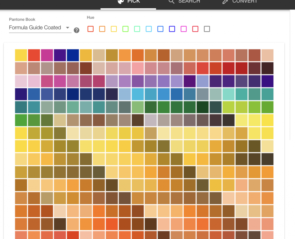
At Pantone.com they have a free color converter. You can switch from PMS to CMYK in a flash. They also offer Pantone books to sRGB or HEX codes as well. This is what it looks like:
Remember when you’re printing, you’ll want to use CMYK or Grayscale (for B&W) when you upload your files to Printmoz for any type of printing services. You can use the online converter or Adobe to convert Pantone to CMYK to print any items needed like vinyl banners, stickers. Are you trying to do the exact opposite and go from CMYK to pantone? Check out this CMYK to Pantone converter!
When you’re getting anything printed at Printmoz, the color mode your file is saved in is essential to us. So you get the correct color balance on anything you order. When you have specific colors to be matched, they need to be specified in the “Additional Comments” area when you place your order.

Make You Convert Pantone to CMYK First
If your artwork is black and white, it’s a little different. You’ll need to save it in “Grayscale” mode. Submitting your files in the wrong color mode (Pantone), your colors may look off.
Pantone has a variety of matching color swatches that show off PMS colors. They will help you see how the colors will look when you’re printing in CMYK mode.
After You Save Your File From PMS to CMYK
If you’re a designer, you might want to purchase a CMYK color guide. They cost around $159.00. But it will ensure that your clients are getting the correct color schemes they want after you convert PMS to CMYK file types.
Make sure to convert all PMS to CMYK for photography prints, canvas printing or even foam printing. If you don't know the difference between canvas vs foam board printing this is helpful information.
This ensures you won’t waste time and money sending things back for re-printing. It’s better to get it right the first time. Because we know the faster you can get your advertising products back the quicker you can promote your business!
After You Convert PMS to CMYK Make Sure You Submit Your Artwork In Plenty Of Time Before It's Needed
It usually takes Printmoz 2-3 day to print your products, and the average shipping time is about 5 days. Make sure you allow plenty of time for shipping. We also offer expedited shipping at checkout if you're in a rush.
Also, proofread all every piece of art that you send to us. Even if you’re great at grammar, it’s always a good idea to get another set of eyes on your posters or any other printing job before you upload your image.

After You Change Pantone to CMYK, Colors May Look Different On Different Monitors
Televisions, computer screens, tablets, and phones are calibrated differently. Therefore colors may look slightly different when you look at your artwork on your computer than compared to your purchased printed products.
Generally speaking, CRT monitors have vivid colors while if you’re using an LCD monitor, the colors can look more faded and not as heavily saturated.
After you convert PMS to CMYK can cause a color shift in your files. So make sure you make any color balance or saturation shifts to compensate for the way you want your artwork to look when it gets printed.
Having the Pantone color guide I mentioned earlier is an easy way to make sure your file type is the perfect color scheme for you. If you’re a designer and have access to the Adobe suite you’re in luck!
Simple Steps For Converting PMS to CMYK in Photoshop
In Photoshop open your file, click the “Image” in the menu, select “Mode” and click CMYK. That's about as easy as it gets! Using photoshop for this is like a miracle.
Illustrator Is a Little More Complicated But It's Still Easy To Change
Click “Edit,” then “Edit Colors” then “Convert to CMYK.” Then click on one of the Pantone colors twice. Next, click “Color Mode” on the menu and then click “CMYK.” Finally, go to “Color Type” menu and click “Process” then click “OK.” Follow these steps for every Pantone colors in your file.
How to Convert PMS to CMYK Using InDesign
First click “Window,” then “Color and Swatches.” Then in the upper right corner, click the arrow before picking “Select All Unused.” Second, put all unused colors by clicking on the trashcan icon. Thirdly, click on one of the Pantone colors twice. Click “Color Mode,” then CMYK then “Color Type” then “Process,” then “OK.” Do this for every Pantone color in your artwork.
It’s no secret that Pantone is a favorite color palette to use in graphic design. So each time a design is made it needs to be changed to CMYK. It's such a simple process!
Some Of You May Want To See An Image in Pantone Green to Start
Pantone colors are broken down into groups. There is Pantone C (which means coated and is suitable for spot color ink in printing on paper), Pantone U (which means good for printing on uncoated paper), Pantone 19-5513 TCX (which is right on textiles and soft fabrics), There also Metallics coated which are best for coated paper in graphic design. Pantone.com is still the best place to see all the various Pantone color for different jobs.
An Image or Pantone Grey or Any Other Color May Look Different Depending On Some Factors
The way colors look is dependent on what you’re going to get your colors printed on. Be it uncoated paper, or a dress. It also depends on your monitor to use and even the lighting in the room.
Even When You Use an Accurate Pantone to CMYK Conversion
There are lots of things that can affect the way a color looks. If you have a color, let’s say a Pantone red C, and there are many variations or red, if you place the color next to a contrasting color, it might look different than if you put it next to a complementary color. Or if you place it in the middle of a grid of purple blocks with white lines between each block. Your eyes can play tricks on you.
It will also make a difference if you have a halogen lamp bulb in your office, a fluorescent bulb, or a soft white light bulb. If the sun is coming through your window, it can also affect the way you see the colors on your monitor or on a printed piece of paper.
Papers and Light Make Things Look Slightly Different
So if you order a glossy print or a matte print, the colors can also vary. So there is a science to color, but there is also the artist in each of our eyes that can see things a little differently than the next person.
So if you order a glossy print or a matte print, the colors can also vary.
So there is a science to color, but there is also the artist in each of our eyes that can see things a little differently than the next person.
When you follow the steps outlined in this article, every piece you send to Printmoz will make you look like a graphic design pro! We’re so excited for you to submit your artwork today and let us show you the magic.


Leave A Reply