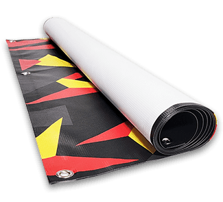
Our professional custom vinyl banners are digitally printed using a full-color, eco-friendly UV printing process on your choice of 13 oz, 18 oz vinyl, or 8 oz vinyl mesh material. All our banners include free grommets and hems with wind slits and pole pocket display options. These banners are perfect for businesses, personal events, trade shows, and other special occasions. Pick a design template or upload your own graphics to get started today! Read More
Quick Overview of Custom Vinyl Banners
• 3 Durable Material Options
• Great for Indoor and Outdoor Use
• Vibrant, Full-Color Printing at 1000dpi
Make a Lasting Impression With Custom Vinyl Banners From Printmoz!
With 3 rugged material options to choose from, our vinyl banner printing is a surefire way to design showstopping viny signs within your budget and delivered fast! Crafted from premium vinyl, these built-to-last custom banners are printed with UV ink that's crisp and fade-resistant. Create an attention-grabbing vinyl banner with free grommets and hems that speaks directly to your target audience
Unparalleled Quality
Effortless Design
Versatile Installation

Common Applications for Vinyl Banners
• Grand openings
• Trade show booths
• Sports team sponsorships
• Birthday parties or weddings
• Real estate signage
• In-store promotions
• School and church events
• Holiday sales and seasonal decor
The possibilites are endless with the right banner from Printmoz. Bring your vision to life today.
Our Most Popular Vinyl Banners Templates
As a courtesy, we've curated this collection of easy-to-edit popular design templates for you to choose from. Use the menu across the top of the templates to filter categories for industry and event-specific designs. Even those without a graphic design background can create the perfect custom vinyl banner using their imaginative concepts with just a few clicks. Go on, click one to get started!
Reviews for Vinyl Banners
Rating
All five stars! They were very patient with us. We had many changes and they worked with us even with some confusing moments that we produced. This is a fantastic group of people.
Printmoz is my go to for all my printing needs. Quick, easy and affordable.
Vinyl Banners Frequently Asked Questions
How much does a large vinyl banner cost?
Vinyl banners are typically sold by the square foot. Our vinyl banners start at $2.69 per sqft, so as an example: A full-color large banner printed at 8' x 10' (80 sqft) made from 13 oz vinyl with grommets and hems costs $215.20. This price includes the standard 3-day turnaround and the printing cost but excludes shipping and taxes, should they apply.
How long does it take to get a vinyl banner from Printmoz?
Please note that the production time for vinyl banners will begin upon file upload and online proof approval. All orders placed before 8 am PST will be shipped as fast as the next business day. However, orders placed after 8 am will be processed as if placed the following business day. As for when you will receive your vinyl banners: the shipping time will depend on the method selected, with standard turnaround and ground shipping taking 5-7 business days. If you require faster delivery for your vinyl posters, we offer same-day production and next-day shipping options at an additional cost which can be found by adding all your items to your shopping cart.
Are double sided banners available?
Yes, we offer double-sided banners printed on heavy-duty 18 oz vinyl material. To select double-sided printing, use the dropdown on the design tool to select the heavy-duty 18 oz material and choose the "Printed Sides" option "Front and Back."
Are gloss and matte finishes available?
Our banners feature a beautiful, matte vinyl finish. Gloss vinyl reflects light and produces unwanted glare, which can ruin your canted moment. Based on years of rigorous testing, our matte vinyl banners have been proven to be the most visibly effective and longest-lasting option, even in locations with varying lighting conditions. The flat, muted finish with a subtle sheen and UV ink with a matte finish provides unparalleled results. Trust us - we know what works best.
Do you offer free ground shipping on your vinyl banners?
No, we currently do not offer free ground shipping on vinyl banners. Check back for other promotional offers, and don't forget to subscribe to our newsletter so you don't miss out on deals!
Can vinyl banners be used outdoors?
These make for great custom outdoor banners. Our 13 oz and 18 oz vinyl options are weather-resistant and UV printed to withstand sunlight, rain, and wind for extended periods.
What are the different weights for vinyl banners?
What are the most common vinyl banner sizes?
Popular sizes include 2' x 4', 3' x 6', 4' x 8', and 5' x 10'. However, we offer full customization so you can literally order any dimensions to fit your space and application.
What are the maximum print sizes available?
What other banner materials besides vinyl does Printmoz specialize in?
We offer mesh banners (great for wind flow), fabric banners (for a softer look), and retractable banners (for trade shows or presentations).
Can vinyl be recycled when the banner is no longer needed?
Vinyl is not easily recyclable through curbside programs. You’d be better off reusing banners for other purposes or donating them to schools or community organizations if possible.
Are banners with wind slits an option at Printmoz?
Yes. We can add semi-circular wind slits to your outdoor banner to help reduce wind stress and prolong its life in breezy environments. However, mesh is usually a better material in these cases.
Do pole pockets contribute to the final banner size?
How do I hang my vinyl banner?
How do I store my vinyl banner when not in use?
Roll the banner (never fold) with the graphics facing outward. Store in a cool, dry space away from direct sunlight or heat sources.


